The Poorly Shod Cobbler; What if their Website is no Different!
The saying has a lot to do with it… Your agency’s website should stand out from the crowd
Choosing a web agency is a strategic decision for the success of your online projects. Your first impression of an agency is often established by visiting their website. It represents their digital business card, a direct sample of their skills and style. Here’s how Whelk suggests to analyze the various aspects of an agency’s site to better assess their potential.
The agency’s website speed
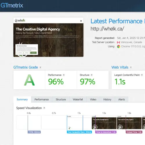
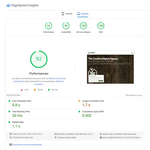
A slow website can be a sign of poor technical mastery. Use tools like GT Metrix or Google PageSpeed Insights to measure loading time. Ideally, a site should load in less than three seconds. Fast loading is not just about a good user experience; it also influences search engine optimization (SEO). If the agency can’t optimize its own site, it’s likely to have trouble meeting your needs.

The poorly-shod cobbler: how to assess the skills of your future web agency?
Examine whether the agency’s website offers clear and complete descriptions of their services?
How user-friendly is the site?
A well-designed site should offer intuitive navigation. Ask yourself the following questions: can you easily find information about their services? Is the menu clear and organized? Good ergonomics reflect an understanding of user needs. If you feel frustrated while navigating the agency’s site, this could indicate a lack of UX/UI design skills. Also look for elements like well-positioned calls to action (CTAs) and logical information architecture.
Is the content relevant?
The content of a website is the cornerstone of its value. Consider whether the agency’s site offers clear, comprehensive descriptions of their services. Is there enough content? Are they able to present their expertise convincingly? Are the texts adapted to the target audience? Quality content needs a balance between form and substance: enough information to be complete, but not so much that it overloads the user.
Examine the images, typography and colors used

The agency’s creativity and professionalism should stand out…
How authentic is the presentation?
A website that impresses at first glance is often a good indicator of an agency’s creativity and professionalism. Examine the images, typography and colors used. Are they genuine visuals or a bunch of random generic images from stock? A neat, harmonious layout shows attention to detail and a concern for excellence.
The very soul of the agency’s website
A well-designed site needs to be more than just functional: it needs to have a soul, an identity of its own. This factor is often subjective, but you should ask yourself: do you feel a particular connection or attraction to the style presented? A site without originality may reflect a lack of imagination or effort, both crucial elements in creating innovative web solutions.

Does the website’s style convey the message?

To educate and inspire confidence, that’s what we aim to do…
Does the website offer useful information?
A website shouldn’t just showcase a company; it should also educate and inspire confidence. Look for a blog that shares tips or news, social networks that show their dynamism, and case studies that illustrate their achievements. These elements demonstrate the agency’s competence while giving you an idea of their strategic approach.
Conclusion: actions speak louder than words
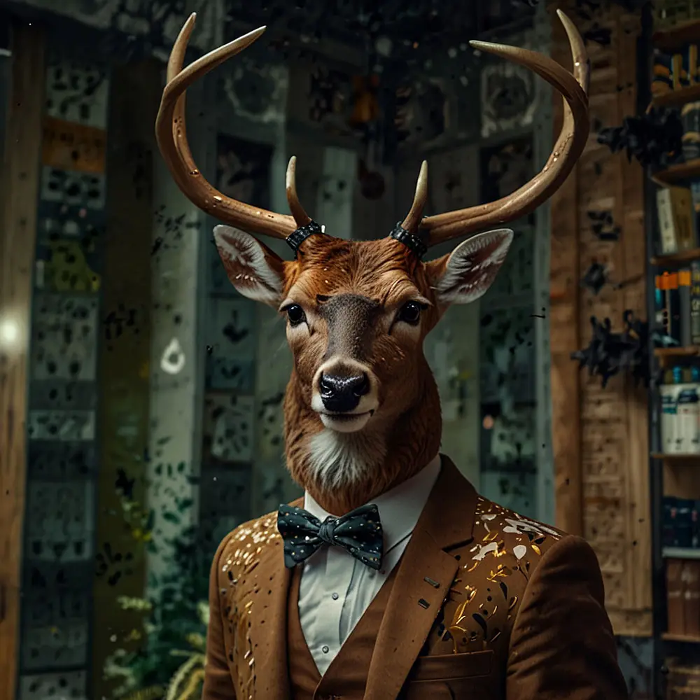
Why all the deers and why WHELK?
To conclude on a personal note, many people ask us why we use deer in our visual identity and why we call ourselves WHELK.
In fact, WHELK is an acronym for “Web”, “Hosting” and “ELK”. That’s why our DNA is revealed through visuals created using artificial intelligence in our blog posts, demonstrating our ability to innovate and have fun with technology when appropriate.
With these key points in mind, you’ll be better equipped to choose a web agency that not only meets your needs, but exceeds them.